The Basic operation of Tableau is to connect to the data sources to get the data and select the dimensions and measurements of that data such as selecting the required column from sources data and then apply the visualization on the selected data such as a graph or the charts.
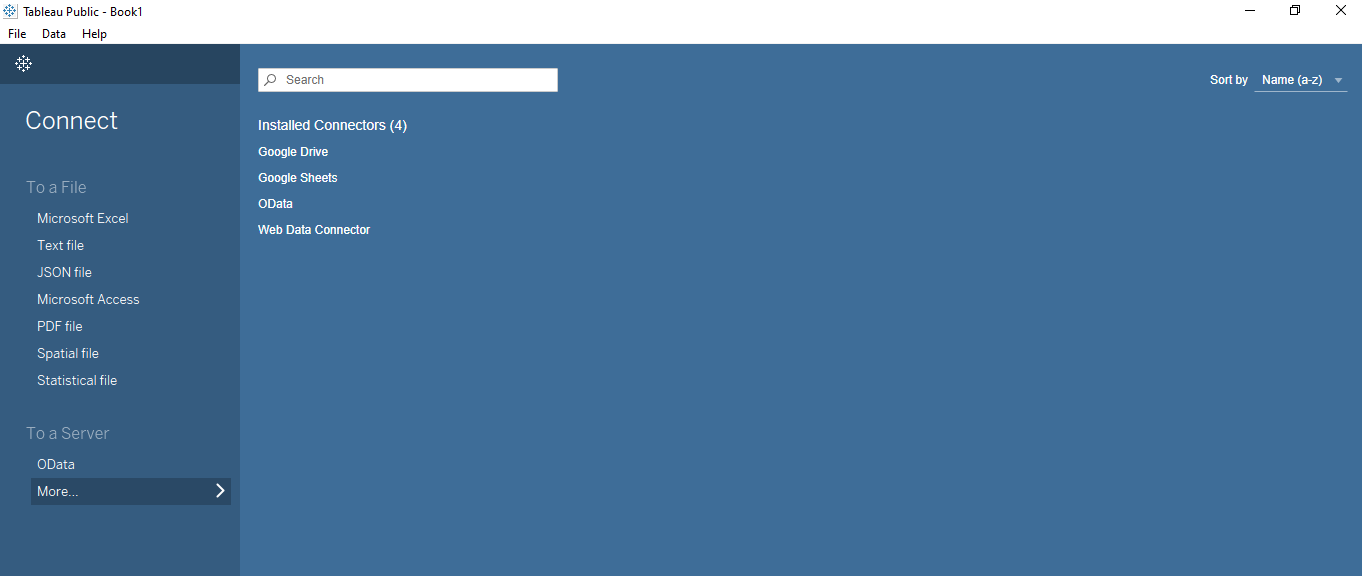
Tableau supports the connectivity with various data sources such as Amazon Redshift, Amazon EMR Hadoop, Hive, Apache Drill, Oracle database, Azure SQL database, Google Big Query, IBM DB2, Impala, MySQL, SAP HANA, TERADATA, JDBC/ODBC databases, Spark SQL, Splunk, Microsoft Excel, Text File, JSON File, Microsoft Access, PDF file, Staticial Files and many more sources.
To create a Tableau Data Analysis report the following three steps are required.
- Connecting to the Data Source
- Choosing the Dimensions and Measures
- Applying the Visualization
To easily explore Tableau, let's connect with the default data sets that come with the Tableau installation. The location of the Data set is C:\Users\Your_Username\Documents\My Tableau Repository\Datasources\2021.2\en_US-US. Under this location, we can see two data sets with the name "Sample - Superstore" and the "Word Indicators".
Let's explore all three steps in the below section.
Connecting to the Data Source
Tableau provides connectivity with a variety of Data Sources and in this section, we will explore the default dataset that comes with Tableau. Open the Tableau Public version from the Windows Start menu. We can see the various data sources under the Connect header.
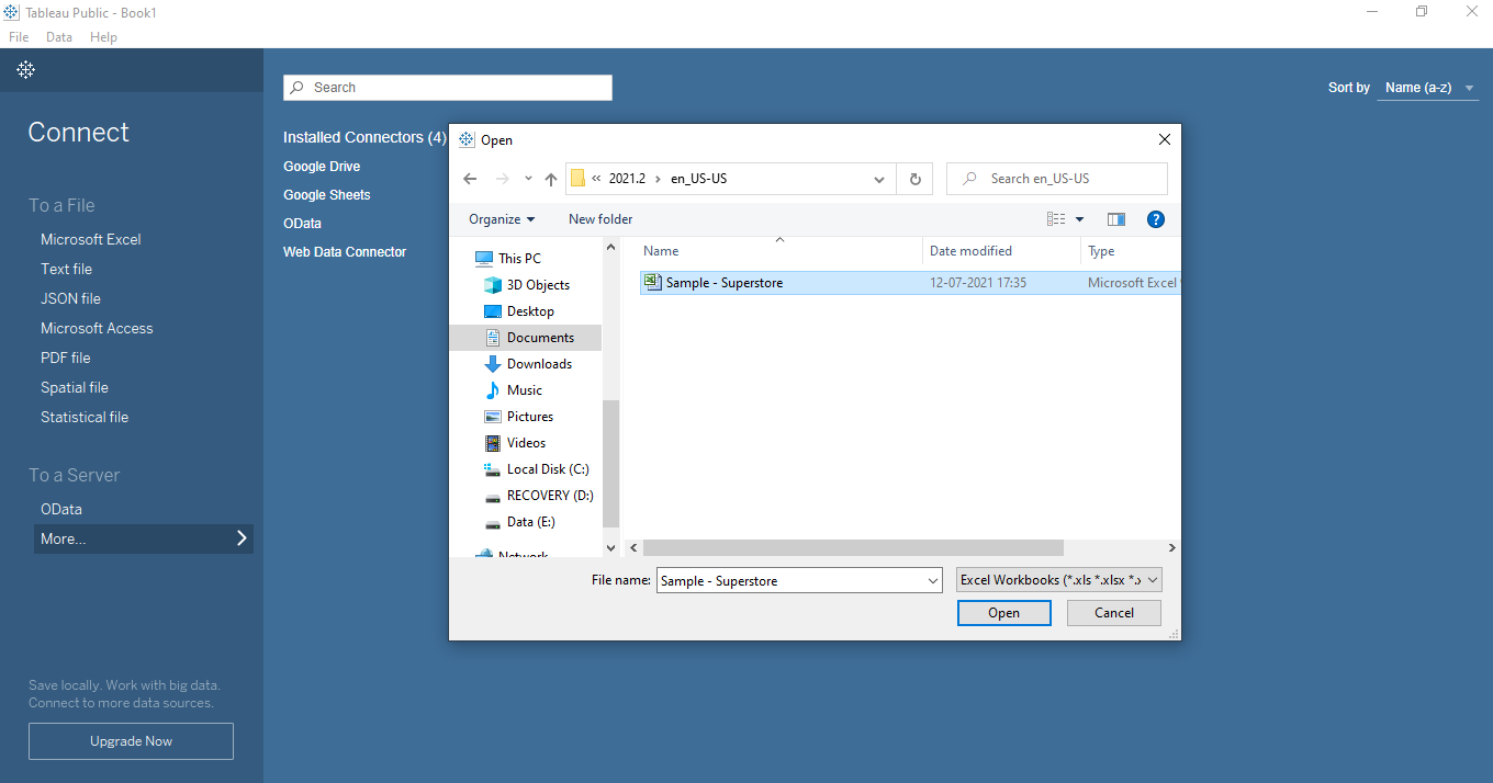
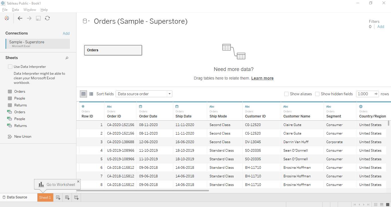
Select the Microsoft Excel file option and navigate to the Sample – Superstore.xls dataset.
The following three sheets of the excel file Sample – Superstore.xls will be seen namely, Orders, People, and Returns. Now let's use the Orders sheet and drag and drop it in the box as mentioned below.
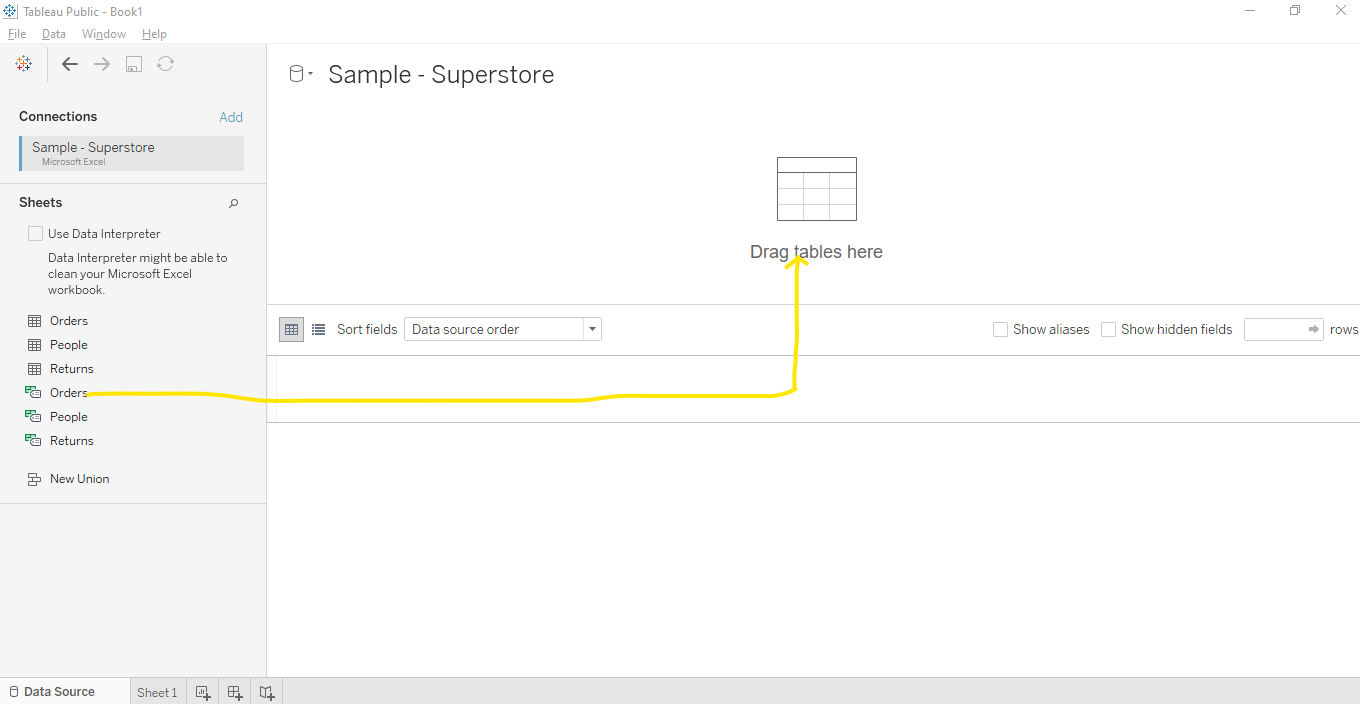
Once the Orders sheet loading is completed in Tableau, we can see the following data. Now go to Sheet 1.
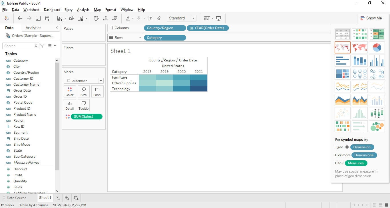
Choosing the Dimensions and Measures
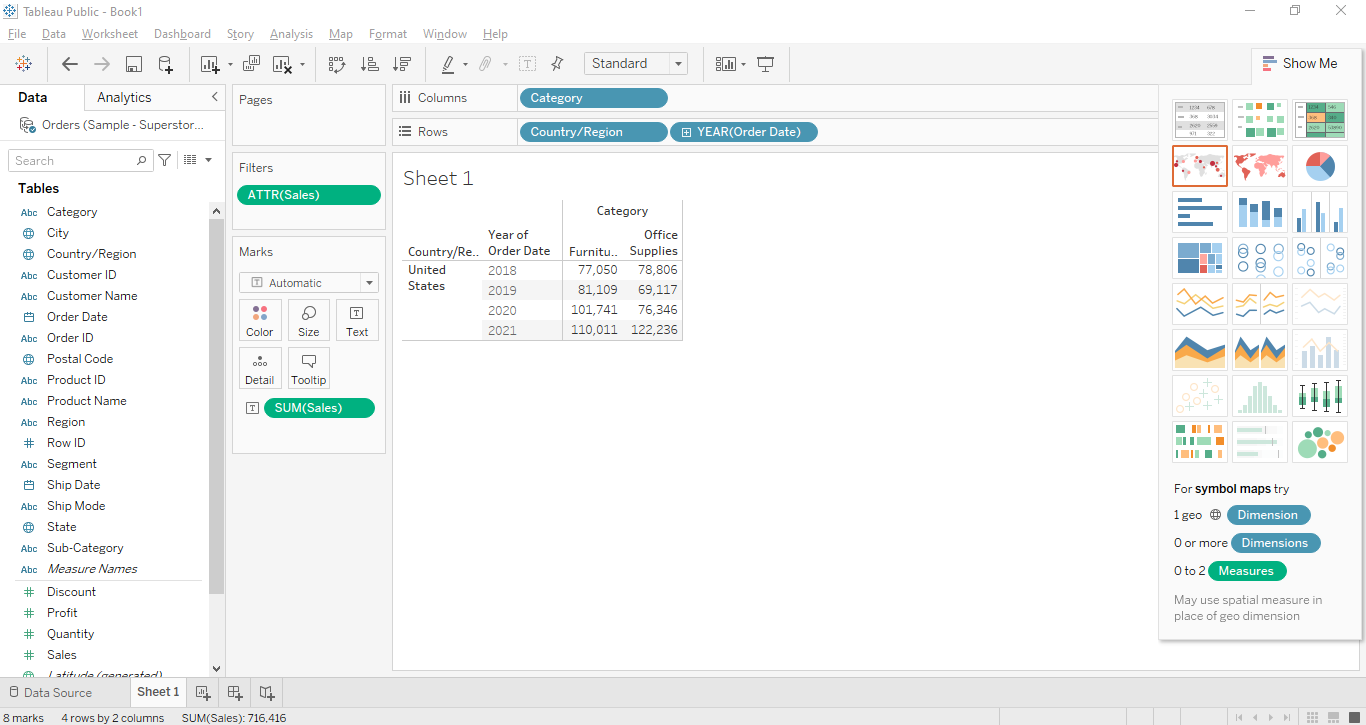
By choosing the Dimensions and Measures we can perform the analysis on row data. The Dimensions represent the descriptive data and the Measures represent the numeric data, so to get the visual performance we can use both. For example, let's choose the Country, Category, and Year as the dimensions and Sales as the measure as mentioned in the following figure. We can just drag and drop and the below result which shows the yearly stats of sales.
Applying the Visualization
By applying the Tableau Visualization Technique on the row data, we can see the data visually and quickly understand the insight of data. Let's drag and drop the Country, Year in Columns tab and Category in the Rows tab. Now let's put Sales sales in the Marks Tab on the Color option. We see the following chart will be created which shows the Category wise sales data.