Tableau Charts provides a graphical representation of data in which data is represented in a symbolic Graph form such as BAR Chart, Line Chart, Pie Chart, to provide in-depth detail of data also provides the relationship between the data. Using Tableau Charts, you can read data easily and make a better decisions. The Show Me feature of Tableau automatically provides the suggested Charts once you drag and drop the dimensions and measures, so Basically Tableau suggests a default Chart based on the data that you have selected.
Tableau Charts Type
The following is the list of different types of Tableau Charts.
- Tableau Bar Chart
- Tableau Line Chart
- Tableau Pareto Chart
- Tableau Area Chart
- Tableau Histogram
- Tableau Pie Chart
- Tableau Tree Maps
- Tableau Scatter Plots
- Tableau Bubble Chart
- Tableau Heat Maps
- Tableau Maps
- Tableau Bullet Chart
- Tableau Gantt Chart
- Tableau Box and Whisker Plots
- Tableau Waterfall Chart
- Tableau Motion Chart
Let's go through some of the Tableau Chart and Maps in detail and see how it is created. We would be using the default data set "Sample Superstore" for the creation of Tableau Charts.
Tableau Bar Chart
The Tableau Bar Chart is a common and very effective data visualization that is used to show the trend, find the difference between the categories, show the difference between historical data.
Please follow the below steps to create the Tableau Bar Chart.
- Load the "Sample Superstore" and go to sheet 1.
- Drage the "Category" from the Data pane to the Column section.
- Now Drage the "Profit" from the Data Pane to the Row Section.
- The Bar Chart will automatically be created.
- In case it is not appearing then go to the Marks Card and select the BAR.
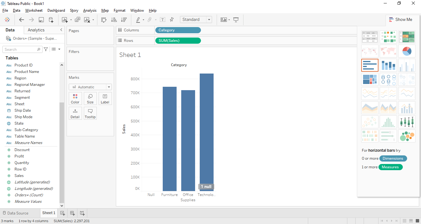
Tableau Line Chart
The Tableau Line Chart is used to display the detail of information in the form of data points. These data points are connected through a straight line.
Please follow the below steps to create the Tableau Line Chart.
- Load the "Sample Superstore" and go to sheet 1.
- Drage the "Order Date" from the Data pane to the Column section.
- Now Drage the "Quantity" from the Data Pane to the Row Section.
- The Line Chart will automatically be created.
- In case it is not appearing then go to the Marks Card and select the LINE.
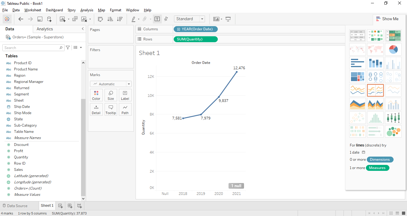
Tableau Pareto Chart
The Tableau Pareto Chart consists of both charts the BAR chart and the LINE chart and it has the same measure for creating the Graph. This chart is used to show the contribution of field members.
Please follow the below steps to create the Tableau Pareto Chart.
- Load the "Sample Superstore" and go to sheet 1.
- Drage the "Sub-Category" from the Data pane to the Column section.
- Now Drage the "Sales" from the Data Pane to the Row Section.
- The Pareto Chart will automatically be created.
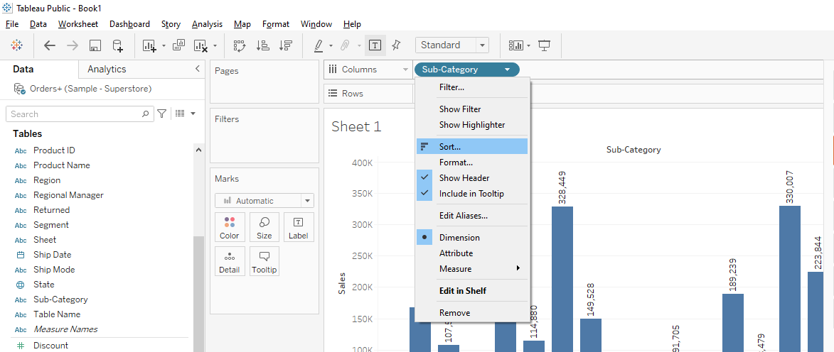
- Click on the drop-down of Sub-Category and select the SORT option.
- Now select the descending option based on the Sales field and the below graph will be created.
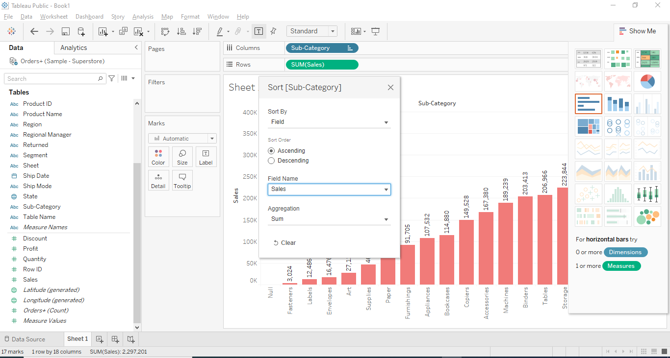
Tableau Area Chart
The Tableau Area Chart is used to present the quantitive data for some time period. It is also a line graph in which the color identifies the area between the line and axis.
Please follow the below steps to create the Tableau Area Chart.
- Select the "Order Date" and "Quantity" by holding the CTRL button on the keyboard.
- Select the "Area Chart" option from Show me which is located at the top right side of the sheet.
- Now Drag and drop the region in the color box.
- The following "Area Chart" will be created.
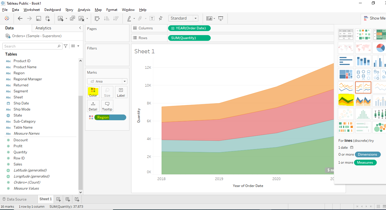
Tableau Histogram
The Tableau Histogram is used to show the data visualization based on the data categories, for example, the employee performance, the number of employees who are a manager, and so on.
Please follow the below steps to create the Tableau Histogram.
- Select the "Sales" by holding the CTRL button on the keyboard.
- Select the "Histogram Chart" option from Show me which is located at the top right side of the sheet.
- The following "Histogram Chart" will be created.
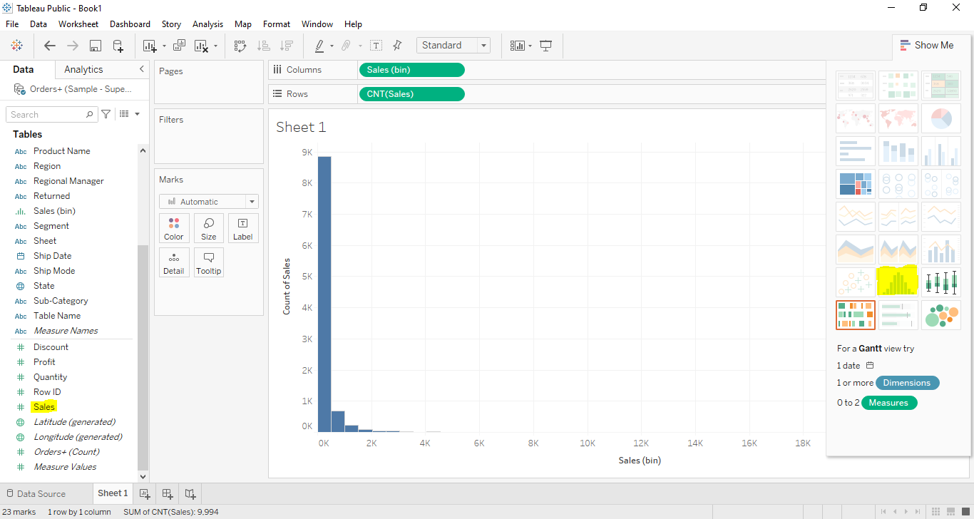
Tableau Pie Chart
The Tableau Pie Chart is represented as the circular statistical graphic. In Pie Chart the measured value is defined by the angle of the pie. We can assign various colors in the Pie Chart to represent the different members in the dimension.
Please follow the below steps to create the Tableau Pie Chart.
- Select the "Region" and "Discount" by holding the CTRL button on the keyboard.
- Select the "Pie Chart" option from Show me which is located at the top right side of the sheet.
- The following "Pie Chart" will be created.
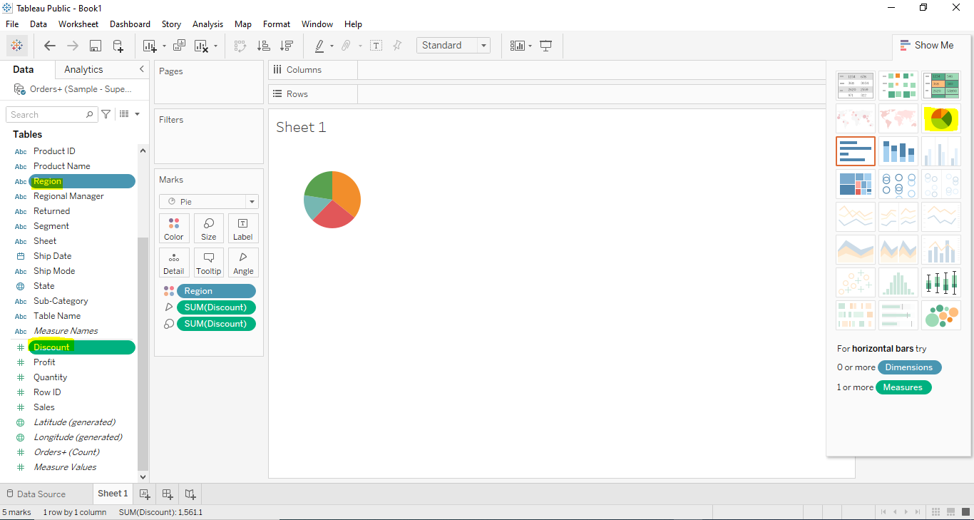
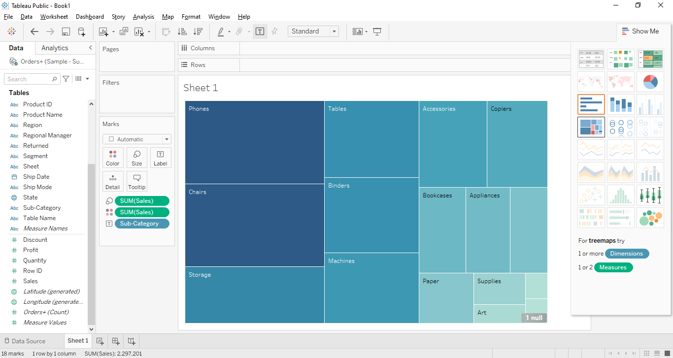
Tableau TreeMaps
The Tableau TreeMaps is used to represent the data in the nested rectangles. The dimensions are used to define the structure of the treemap and the measures are used to define the rectangle's colors.
Let's see the below example to aggregated sales totals for the products categories.
Please follow the below steps to create the Tableau Tree Maps.
- Drag and drop the Sub-Category dimension in Columns.
- Drag and drop the Sales measure into the Rows.
- Now select the Treemap Chart from Show me.
- The below Treemap Chart will be created.